- Select a brief passage from Chapter Three of Emotional Design by Donald Norman and post it on your blog (right here). Explain why you thought it was interesting.
"Advertising can work at either visceral or reflective level. Pretty products — sexy automobiles, powerful-looking truck, seductive bottles for drinks and perfume — play with the visceral level. Prestige, perceived rarity, and exclusiveness work at the reflective level. Raise the price of Scotch, and increase the sales. Make it difficult to get reservations to a restaurant or entrance to a club, and increase their desirability. These are reflective-level ploys" (87-99).
When I read this part, especially "make it difficult to get reservations to a restaurant or entrance to a club" I remembered an episode of the TV Series South Park I had watched a few days ago. In this episode, one of the characters, Cartman, won $1million and followed his dreams. He bought a theme park. He hated lines and he wanted to be able to ride any item in the theme park whenever he wanted, so, he bought the theme park, named it "Cartmanland" and did not let anyone in, not even his buddies. A few days later, as in the show time, he was on TV as the creator of a new marketing technique: denying costumers entry. Not being able to get in made them want more. It was the exactly what Norman talks about here. People want what they cannot achieve, what they cannot get.
- Norman uses the terns Visceral Design, Behavioral Design, Reflective Design. Do these categories seem useful to you? What other names or phrases make the categories clearer?
I cannot think of better naming of such categories, at least not right now. A Visceral Design success succeeds in visceral aspects; human emotions, instinctive human penchant, physical feelings, appeal... Behavioral Design fits even better. If the products behavior, its function and purpose, is a success, then the design is a success; pretty self explanatory. The name Reflective Design is also useful. Although I had hard times understanding what it meant at the beginning, after the discussion in class it was clear to me. If the design product successfully reflects you to others, or has successful reflections on you (like good memories) then it is successful in Reflective Design. Although I sometimes found Normans points redundant, repetitive or contradictory, these are the perfect words for these terms.
- How could a designer decide if Visceral Design, Behavioral Design, or Reflective Design is more important for a particular product? Are some types of products more visceral, behavioral or reflective?
If I was a designer I would aim to be make a product successful in more than one levels. It shouldn't be hard. A good product might even be successful in all three. I have a lighter that I bought when I was in Amsterdam with "Amsterdam" written on it. It is a simple product, press the mobile part it will be lit, successfully designed behavior; it looks good and fits my hand, successful in the visceral level; it has "Amsterdam" written on it, it shows that either I like Amsterdam or I have been there, reflects a part of me. Successful in all three levels.However, not all products will as easily be successful in all tree levels. When designing an item that might be used as a souvenir the designer should try to make it successful in the reflective level. When designing everyday products designers should aim for behavioral and visceral (especially user friendliness) success. For each product and the possible use of it might have, a level might be more important in marketing than the others, the designers should pay attention to this and try to design accordingly.
Tuesday, September 28, 2010
Amsterdam Burns
Donald Norman again, makes you say "Really, again?" right? But his books are good reads, you should take a look! :)
Monday, September 27, 2010
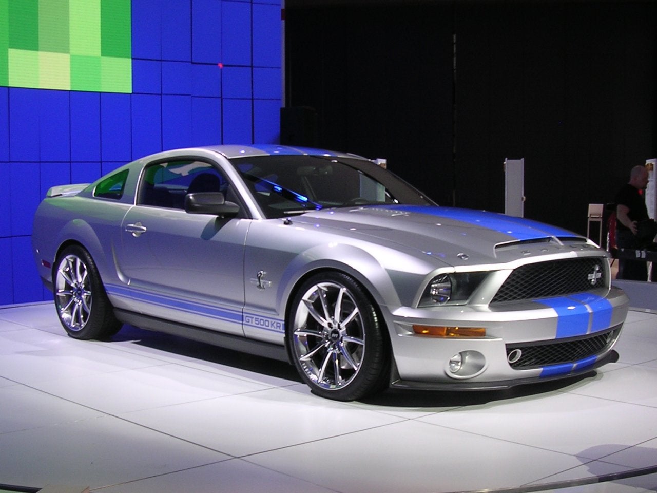
Ford Shelby GT500
Donald Norman is starting to dominate my blog! This time however, the post will be about another book by him; Emotional Design chapter III.
- What do you feel were the author's key points in this chapter?
Norman starts this chapter in his book by an introduction followed by the explanations of the three levels of design: Visceral Design, Behavioral Design, Reflective Design. In the introduction section, Norman, through the water bottles example, states that "the entire success of the product lies in its package, not its contents" (64). "Visceral design is what nature does" (65); Norman starts explaining Visceral Design. It is mostly about the first reaction humans give to a product. These reasons are either common penchants build through becoming a human, or are determined by the experiences of a single person. In short, if something looks good, feels good, it succeeds in Visceral Design. On the contrary, Behavioral Design focuses on the function and performance of the product rather than its appearance. "If the item doesn't do anything of interest , then who cares how well it works?" (70) is how Norman explains the dynamics of Behavioral Design, stating function is the most important factor. "After function ocomes understanding" (75). A product needs to be self-explanatory, people should not need manuals for using, and if they ever do they should be able to read it once and never need it again. Usability is also covered in this section, it is defined to be complex: "A product that does what is required, and is understandable, may still not be usable" (77). Furthermore, Norman categorizes physical feel in the checklist in a successful Behavioral Design. Another key point he includes in this section is that designers and engineers need to observe thier target audience and determine their needs if they aim to be successful. Moving on to the third level of design Norman explains Reflective Design by stating that it is about what the product means to the consumer and what message it gives. He also says that long-term costumer experience is a criteria for Reflective Design.
- How does this chapter compare to the earlier writing (The Design of Everyday Things) by the same author?
The earlier writing was only focused on everyday products and mostly their usability and how-to-use. However this writing covers a broader range of topics and even includes the topics covered in the earlier writing like the conceptual model and understanding how to use a product at the instance that one encounters it. In this writing the concept of successful design is divided into three. Although sometimes these may contradict, if a product is to sell and be successful it needs to be successful in at least one of there three. Another similarity between the two writings is that Norman again includes a lot of examples and anecdotes.
- Give examples, from your own experience, of (i) something that succeeds as Visceral Design, (ii) something that succeeds as Behavioral Design, and (iii) a Reflective Design success? What do you thing makes each thing successful?
A Visceral Design success... Looks good... Cars? A Ford Shelby GT500 perhaps! This car just looks so good, so cool, so muscular (d'oh, its a muscle car). I mean who would love that looks. Although this car is not the best in performance vs cost or in its category I would buy this one just because of its appearance. But its fuel consumption is very high. Who cares?! It looks nice! Continuing with the cars concept, lets give an example of Reflective Design success. I watched the episode of Cribs on MTV featuring Shaquille O'Neal's mansion. After riding a bike inside the house he showed his car collection. He had a lot of them, a lot... He had a Ferrari F50, which is a classic, one of the best cars to walk on Earth, only a limited number exist. He said that he bought this car only to say "Hey, I have a F50 too!", if conversation on the car was ever brought up. He probably cant fit into the car anyway. This is a Reflective Design success by Ferrari. Their company, their cars symbolize wealth and uniqueness, so that people buy these cars to show off or try to reflect their personality. An example of a successful Behavioral Design would be a cap a friend of mine owns. The cap looks funny, when he puts it on he looks like he is bald and being bald doesn't look good on my friend. The cap also covers his ears. Its not visual. Its function however: wow! The weather is -25 Celsius degrees outside; its very cold. No problem, just wear the cap! It will really keep your head and your ears warm. Although it is not a visceral success the product does its job: keeps you warm.
Friday, September 24, 2010
An Elders Ideas
More questions, therefore, more talk about The Design of Everyday Things by Donald Norman. I believe this time I will go deeper into the article.
- Select a brief passage from Chapter One of The Design of Everyday Things (Donald Norman) and post on your blog. Explain why you thought it was interesting.
This passage is the last part of Donald Norman's anecdote on his conversation with a designer: "Now you understand," said the designer. " Consider the use of voice messages on complex devices such as cameras, soft drink machines, copiers. A failure. No longer even tried. Too ad. It us a good idea, for it can be very useful when the hands or eyes are busy elsewhere. But those first few attemps were very badly done and the public scoffed — properly. Now, nobody dares try it again, even i those places where it is needed." (29) My reason for selecting this passage is that while reading the chapter this was the only part that I have had not actually thought about. On all the other points the author made I had a say in my mind or I had thought about earlier: they were familiar points. However I reacted to this passage with an admiring "cool" and noted; g point as in good point. I found this idea very intelligent and I absolutely agree with it now I read it. This passage was like the last piece of a puzzle that made everything clear. Not only dazzling but it was also informing. After reading this I believe I took another step into the business word; thank you Norman!
- Norman's book was first published in 1988 and still influences designers today. Why do you think this book continues to be influential 20 years later?
I believe there are a few reasons. The first one is that Norman does not build his book on specific examples. Even though they are included in his book, they are open-ended examples of and common products. Also, the audience of the designers is still human beings as it was 20 years ago as it will be 20 years later. The addressee of the design did not change. The designers should make their products clear for the people and there is a general way in people's perception in such everyday things, therefore, Norman's points are still influential. The way people perceive things now is not much different from the way they did years ago. Yes, the technology changed, the environment and the norms have been modified, but still people use the the simple everyday objects as simple everyday objects: a door is still a door. Hence, Norman talking on simple everyday products also makes his points influential after long years. Furthermore, his points in the book are clear and precise. He just tells what is wrong and how things should be. In a nut shell, Norman addressing common points in a clear tone makes his book influential even after all those years. Honestly, I believed this was a recently published book before reading this question.
- Based on this chapter, what factors would you include on a checklist for evaluating the design of a product?
- How easy is it to use the product?
- Is it universally comprehensible?
- Is it simple and not complicated?
- Button/function ratio (does not have to be 1 but a button should not have millions of functions)
- Does it include natural mapping?
- How easy is it to remember the use of controls?
- Explanatory words/letters/pictures (I disagree with Norman and still believe these should exist.)
- After all of these is it attractive and aesthetic?
- How function-able/needed is it?
- Will people buy it?
Tuesday, September 21, 2010
Designed To Be Simple
Donald A. Norman talks about the flaws in the design on everyday things in the first chapter of his book The Design of Everyday Things. After reading the chapter, I am now to answer the questions I was assigned:
- What do you feel were the author's key points in this chapter?
Donald Norman points out his key points so clearly that he leaves me very little work to do. In the first part of his chapter states that "Well-designed objects are easy to interpret and understand. They contain visible clues to their operation. Poorly designed objects can be difficult and frustrating to use" (2). This is basically what the chapter is about in a whole. However, he points out that he will not only identify the problems but attempt to change the way of things. Donald Norman believes the design of an everyday object should not evoke any questions and should be self-explanatory without signs or drawings but merely by tiny but well placed clues. He also declares that these clues should be aesthetic and fit into the object. He names this as visibility: "The correct parts must be visible, and they must convey the correct message" (4). After talking about incomprehensible and poor designs he makes a simply point: don't buy them. Although he mostly disregards this option in most of his arguments,his reasoning that if people keep buying the poorly designed products the companies will get the wrong message and continue to make them is very reasonable. Afterward, he shifts the topic onto psychology of materials and psychology of causality. Here he explains by an example that some material are doomed to be targeted by vandals. In the Twenty Thousand Everyday Things part he indicates that even if learning how to use an every product took 1 minute, adapting a lifestyle full of them would take a lot of time. Following this criticism, he moves onto explaining what would make a design good. Here, he again underlines visibility and also adds that providing a good conceptual model is very helpful. In the following pages, he talks about modern everyday items like telephones. He states that as technology develops the complexity of simple everyday items start following an U-shaped graph: an increase and then a decrease in complication. After talking about cars, he recommends one button or switch having only one function to keep things simple. Before moving onto The Paradox of Technology through an anecdote he points out that if a new product is introduced with a poor design a few times it will be marked as not-to-be-bought in the eyes of the public. In a nut shell, his key points are that a design of an everyday item should be self-explanatory and simple to use through visibility and mapping.
- Think of a specific object that you have had difficulty using. How did the design contribute to making it difficult to use? Does the usability problem arise from one of the principles that Norman discusses in this chapter?
My fathers dishwasher. It includes one dial that sets the wash program and an on/off button (or at least I assume it is that). The button is a rhombus with a vertical line inside. It also has a screen which through experience is assumed to show the minutes remaining on the wash. One day my father told me to start the dishwasher. I went to the kitchen; asked him which program I should use and set the dial to that program. I closed its cover ( I forgot to put washing liquid in it but that was my bad not the designs). Now I needed to start the program. But how? I discovered I could press the dial, so I did. Nothing happened. So I hit the only button, the the machine turned off. I turned it on and while I was thinking on how to solve the problem the sounds of water flowing into the machine informed me I was successful. I still have no idea how I started the program. It was pure coincidence. Why not add a start stop button?
- How did the designers of the iPod address the principles that Norman discusses here?
I believe Apple products are one of the worlds best in design as in both look and user friendliness. iPod, although having only five buttons and many functions is simple to use. Each button has several functions but only in different menus or applications. The wheel is a living symbol of "design intelligence". Also, while having various functions, the buttons and the wheel always have natural mapping as mentioned in Norman's article.
Sunday, September 19, 2010
The 'Almost' Perfect Thing
In his article, "The Perfect Thing", which can be found here, Steven Levy talks about the creation of the first iPod by Apple. Now, I am assigned to answer three questions on this article, I assume "post answers to the following questions" means i should deal with each question separately.
1) What elements of the design process does this article illustrate?
As it is included in the article, Apple's creation and design of iPod starts with inspections of the current products that fall into the same category as iPod; portable mp3 player. To begin with, various Apple employees examine various mp3 products and highlight their flaws. Through this examination and highlighting process, Apple sets out aims to how to address these flows and make a better, a perfect, product. Some of these ideas include: The brand new scrolling wheel, which will replace the buttons on any other mp3 player and make it easier to scroll through thousands of songs; a HDD (hard disk drive) with huge storage space; the pocket-size dimensions combined with long battery life and lightweight for ultimate portability... In the modeling process the iPod has various curators which cause ideas from various minds to meld together.
The trial & error process is clearly visible in Fadell's three models. He shows three designs to Jobs — hard to imagine how many designs he made until he obtained the best three of them — after which Jobs finds faults in tow of them and admires the third one with a "just right". It is also true that Fadell, plays a little game in his presentation and knowingly brings two faulty and one perfect designs, but still this shows he underwent the trial & error process.
Lastly, although not very deeply illustrated in the article it is clear that, to obtain the perfect product the iPod team puts the iPod under various tests to make sure it is durable and enduring, like the falling test.
2) What factors would you use to evaluate a "perfect thing"?
Although some staying the same these factors would vary from product to product, since different products are used for different purposes. Generally, the looks, weight, size, fit, easily usability, and sometimes simplicity are important factors. Also for a IT instrument, battery life and compatibility is important. There are tons of products running on various software systems, therefore compatibility is a key factor. For an example Apple's iPod only works with iTunes, this is a flaw, since the owner of an iPod has to use iTunes for the iPod to be put into work, and there are a lot of people who use different programs. However, this is a trick, since through a good product like iPod, Apple promotes another of its product; iTunes.
3) Whether you own an iPod or not, you probably have some opinions of this product. What do you feel are its strengths and weaknesses?
In overall, I believe iPod is an almost perfect product: good job Apple. To be on the same ground, I do not own an iPod, but I have seen and used many, and I own an iPhone, which adds all of the capabilities of a phone to an iTouch — the last form of iPod. The design (looks) is very temping. No comment but only astounding admiration to the scrolling wheel and navigation with only four buttons. Although the dimensions are okay, I find the dept-width and dept-height ratios a little low. The weight and size make this product perfect in portability. The huge storage space is more than anyone can desire. The only lacking point I can name is the compatibility problems. iPod will only work with iTunes, which makes people like me who used to use a different music player now use two, or migrate into iTunes, which is quite a work. However I am anything but surprised on this compatibility issue since this is long war from the past between Apple and Microsoft. Fun fact on this cold war: type iPod or iTouch or iPhone on a Apple word program it will accept it, type the same into a Microsoft based word program it will underline it with a red line and mark it is wrong.
Friday, September 17, 2010
Who? What? Where? Why? Which? When? How?
Ok, so this is "from my point of view" but who am I actually? Starting with my name, I am Mehmet — a Turkish guy 5378 miles away from home. My generous mom gave birth to me in Izmir which is a quite large city — especially in comparison to where I am right now; Kalamazoo — on the western coast of Turkey. Since then I was raised there. Henceforth I never witnessed a real winter; I remember it snowed when I was 12 and my dad tells me it had snowed when I was two months old: that's all. Then why did I come here? I have probably answered this question hundreds of times in the last week I was here. Simply put, I wanted to study in the US and in a liberal arts college, so here I am! So far I liked it here, except the food. Mom, I miss your food!
For those who are confused right now (I doubt there will be any since — C'mon why would you read my blog?) with this random but specified information: I created this blog for my Design Intelligence Seminar Class. Normally, I don't do blogs; but schools are full of opportunities eh? However, anyone is welcome to read although I am not sure what I will be posting here. Where was I... Oh yea, classes. In addition to this seminar I am taking a Math class; Math 214 and a Computer Science class which I might change into a Theater class — still not sure. I am yet to decide what I want major in, or double majors minors... I have a range of ideas right now, but generally it will be a combination of math , physics, 3/2 engineering, CS and maybe an art or theater minor. This is mostly what there is to know about me, but you have to meet me in person — socializing through keyboards doesn't work. Also, keep in mind that I tend to be sarcastic, that's pretty important. Take care!
For those who are confused right now (I doubt there will be any since — C'mon why would you read my blog?) with this random but specified information: I created this blog for my Design Intelligence Seminar Class. Normally, I don't do blogs; but schools are full of opportunities eh? However, anyone is welcome to read although I am not sure what I will be posting here. Where was I... Oh yea, classes. In addition to this seminar I am taking a Math class; Math 214 and a Computer Science class which I might change into a Theater class — still not sure. I am yet to decide what I want major in, or double majors minors... I have a range of ideas right now, but generally it will be a combination of math , physics, 3/2 engineering, CS and maybe an art or theater minor. This is mostly what there is to know about me, but you have to meet me in person — socializing through keyboards doesn't work. Also, keep in mind that I tend to be sarcastic, that's pretty important. Take care!
Subscribe to:
Posts (Atom)